
Blacklist is a concept Bar & Lounge located in the heart of Georgetown, DC. The vibe is luxury in secret. It's refuge for the reckless, solace for the shunned, and a bar for the blacklisted.
The branding takes its concept from the name. To be blacklisted means being regarded as unacceptable or untrust-worthy, and that you should be excluded and avoided. Blacklist is where you go when you make the list.


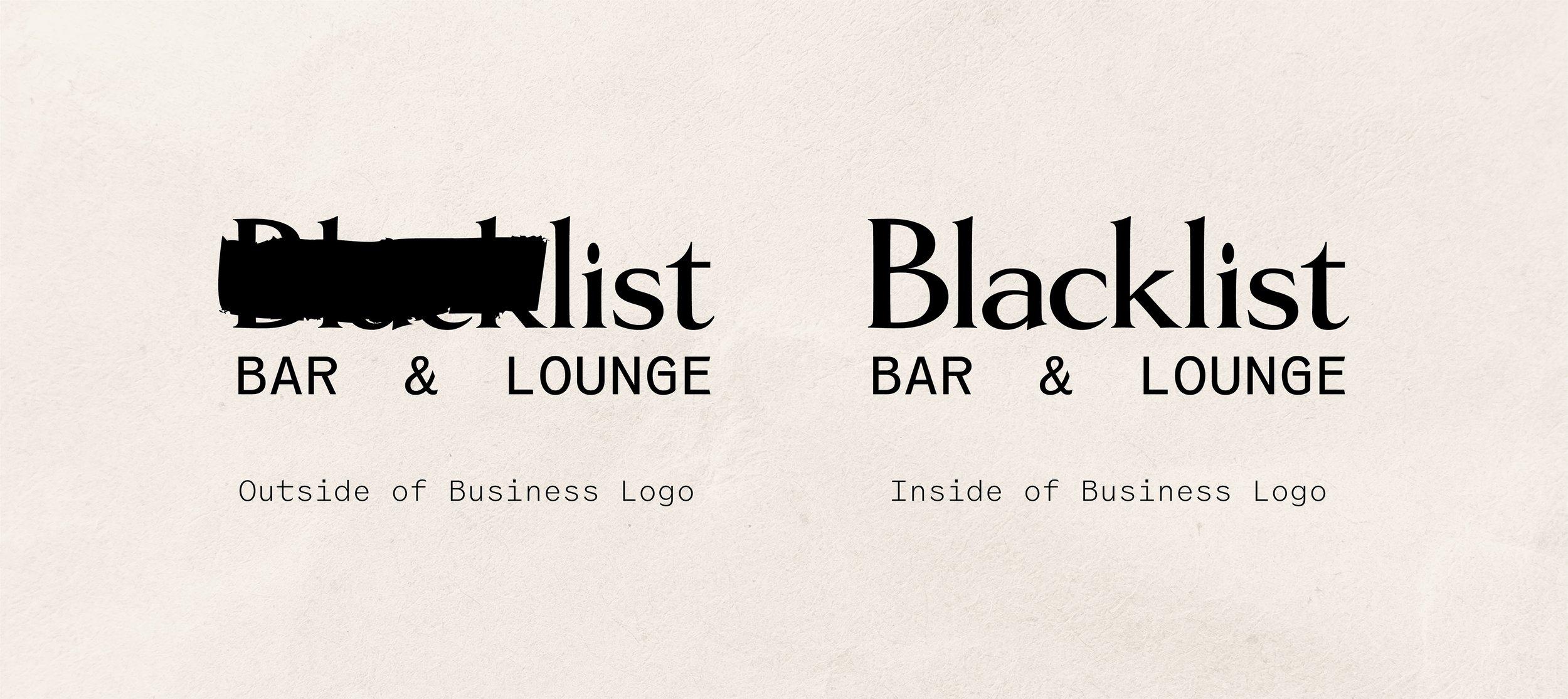


The Logos
There are two variations of the primary logo. One is intended for use on anything found outside of the bar, such as advertising executions, and the other for all branded material found inside of the bar.
The "outside of business" logo features a reoccurring 'black line' motif found throughout the brand, keeping part of the brand anonymous. This continues the idea of secrecy and clandestin-ity throughout the branding. In essence, you aren't privy to the full brand identity of Blacklist until you've successfully made your way into the building, and joined the blacklisted.


The Logomarks
The logomark was designed to mimic the shape of a person's head and face with the black line drawn over the eyes, drawing from the concept of secrecy and desired anonymity that is a part of the Blacklist brand.
The letters 'B' and 'L' were taken from the Blacklist primary logo to form an abstract face.
